Healing Colors for Hospitals: The Science- and Business-Based Guide.
Most people recognize, at least subconsciously, how color influences mood. Just consider how a bright blue sky can lift our spirits on a warm spring day!
So it's not at all surprising that the choice of color palette can dramatically impact the well-being of both patients and staff in a hospital or other healthcare environment.
In fact, according to one recent study, wise color choices can help hospitals reduce medical errors, promote a better sense of well-being and ease stress among patients, help them sleep better, minimize spatial disorientation, and increase staff morale and productivity.
No wonder more and more healthcare designers are moving away from the industrial – i.e., depressing – color schemes of the past and creating spaces colored by hues with the power to heal.
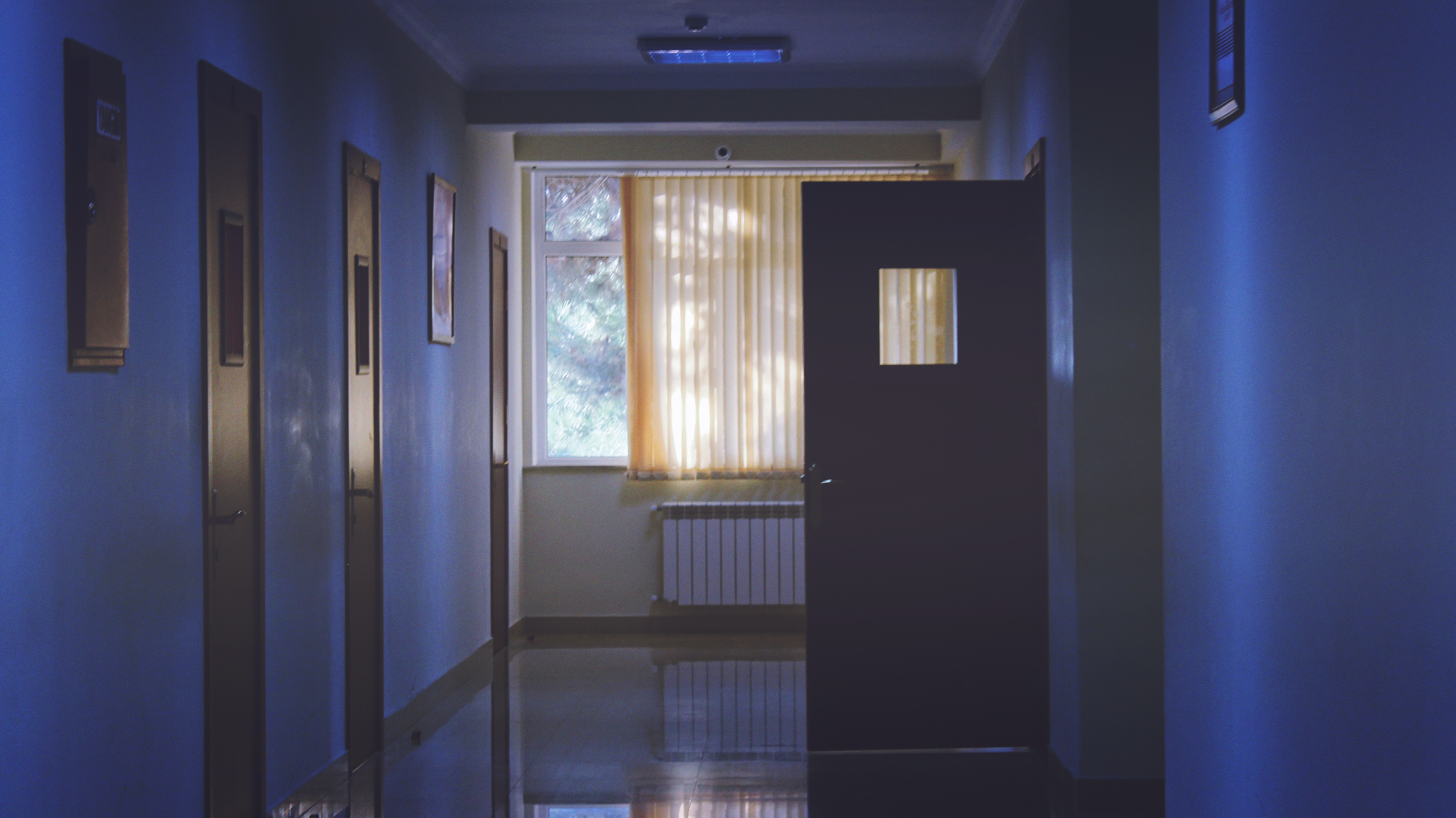
High-Contrast Colors in Poorly Lit Spaces
A healthcare environment might not seem an appropriate venue for high-contrast color combinations like black and white. But the fact is, high contrast can go a long way toward illuminating and defining volumes, shapes, edge changes, and planes, especially in poorly lit areas.
While high-contrast colors aren't the best choice for patient rooms, the wise use of a contrasting palette could also help elderly or sight-impaired patients determine where doors, walls, and turns are so they don't accidentally hurt themselves. In this scenario, it's best to use high-contrast colors to highlight specific areas, such as illuminating a hallway.


Cool Tones for a Calming Effect
Ever wonder why the scrubs worn by doctors, nurses, and other healthcare professionals tend to come in cooler tones, like soft blues and greens?
Cool tones are known to have a soothing, calming effect and may even help alleviate headaches and certain immune system issues. Blues are thought to inspire relaxation, making them great for waiting rooms. At the same time, the natural feel of green has been shown to reduce anxiety in chronically ill patients during extended hospital stays.
One caveat, however. Cool tones can contribute to tedium and annoy patients when used in excess, so be careful not to overuse them.
Warm Tones for Stimulation
Warm tones are known for their energizing and stimulating effects, making these hues an excellent choice for high-conversion service areas where you need to keep a line moving. Warm-toned surfaces on medical carts and workstations can help keep staff energized while using warmer colors in smaller patient rooms can make them feel larger.
An energizing vibe makes red tones great choices when working with patients who suffer from anemia, fatigue, paralysis, and exhaustion or require physical therapy and treatments that require exertion. But it's best to avoid red in areas where patients with schizophrenia, bipolar disorder, and other neurological disorders are present.
You should also avoid reds and other warm tones anywhere blood is common, such as in the OR.
Colors to Avoid in the Healthcare Setting
It's generally a good idea to avoid neon colors in hospitals and other healthcare environments, as they can irritate the eyes and increase patient stress. Some people might associate yellows and browns with human waste, so use them sparingly.
Because they can potentially hinder diagnosis, certain colors should be avoided in exam rooms. For example, people with low oxygen levels or cyanosis often present with bluish or purplish skin. The presence of yellow surfaces may minimize the blue skin tone, while blue surfaces can unnaturally enhance it.
Yellow or blue surfaces can also impede the diagnosis of jaundice in newborns, who typically present with yellowing of the skin and/or eyes.
Color Considerations for Healing Hospital Decor
To create an environment that will facilitate better outcomes and higher levels of patient satisfaction, consider these healing hospital color choices:
- Softer palettes to highlight key features in patient rooms, such as the area behind sinks, cupboard doors, or window walls.
- Strong accent colors in long corridors to aid navigation, identify different departments, and ensure reception areas stand out.
- Warmer palettes in restaurants, cafes, and other public areas.
- Neutral tones create a soothing, restful atmosphere in the ICU.
- OR walls are usually painted green or blue/green to counteract the visual effect of prolonged staring at the deep red of open wounds.
- Color contrast in dementia care settings can mitigate cognitive and perception problems that often lead to falls and increased anxiety.
- Bright and simple color combinations create an impression of fun and reduce anxiety and confusion in pediatric units.
First Products: Committed to Creating Healing Hospital Environments
First Products has partnered with providers to improve the healthcare experience since 1945. From mobile medical carts to portable workstations, our ergonomic solutions are designed to increase efficiency, improve workflows, and – most importantly – encourage higher levels of patient satisfaction through promotion of a more healing hospital environment.
In the unlikely event that our available offerings don't fully meet your needs, we can work with you to customize a perfect-fit solution that will.
To Learn More, Please Contact First Products Today at 800.854.8304


comments